
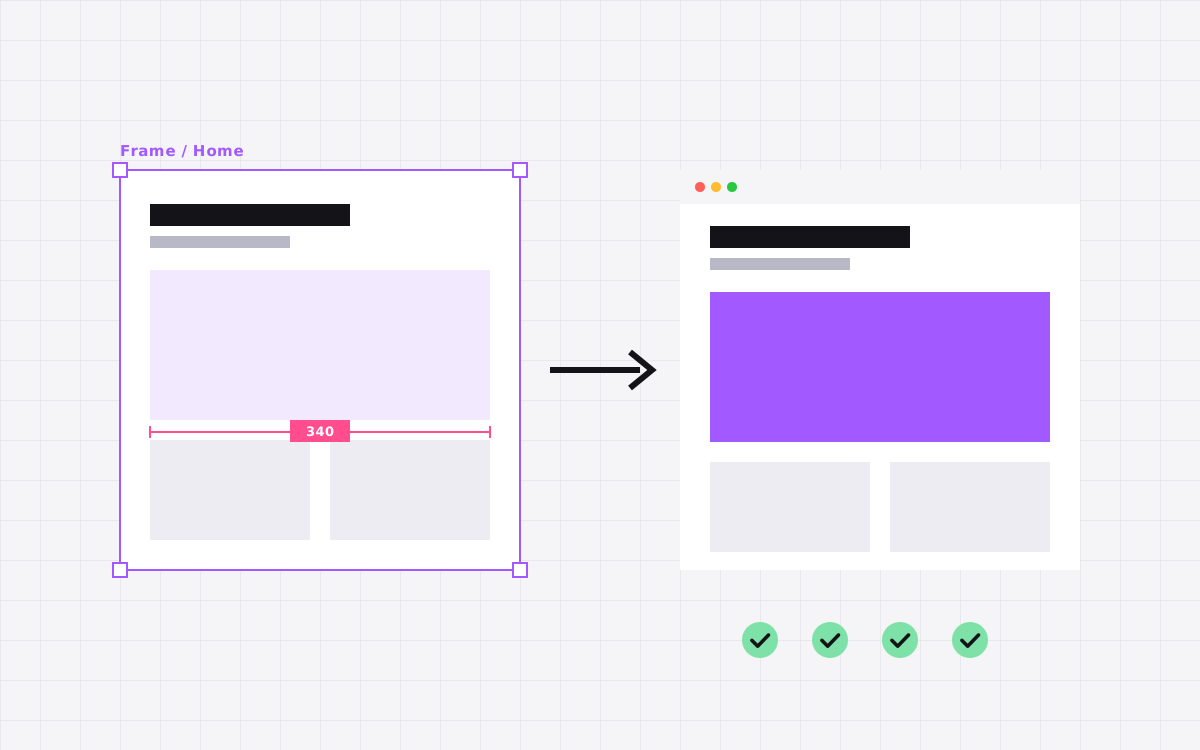
- A clean Figma to Webflow build follows one order: review the file, set tokens, build components, then pages, then CMS, then SEO and QA.
- Most problems start in the Figma file. Auto layout, named styles and a mobile frame save days.
- Build a style guide page in Webflow first. Every page after that gets faster and more consistent.
- Check every breakpoint against the design, not just desktop.
- Hand over with a walkthrough video, editor access and notes on how the CMS works.
The Figma to Webflow checklist in one paragraph
Our Figma to Webflow checklist runs in seven stages: review the Figma file, set up design tokens, build components, build pages, connect the CMS, add interactions, then check SEO, speed and every breakpoint before launch. Doing them in that order is what keeps a Webflow build tidy, fast and easy for your team to edit.
We have used this list on every Figma to Webflow project we have shipped. It is not fancy. It just stops the same mistakes from happening twice. Copy it, change it and use it with your own developer, or with us.
Stage 1: Review the Figma file
Before anyone opens Webflow, someone should go through the design frame by frame. This is the cheapest place to catch problems.
- Every page has a desktop and a mobile frame. Tablet is nice to have. A developer can fill it in, but mobile should not be a guess.
- Text styles and colour styles are named. One off values like 17px or a slightly different grey usually mean a mistake.
- Auto layout is used for sections and cards. It maps neatly to flexbox and grid in Webflow.
- States are designed. Hover, focus, active, error and empty states for buttons, forms and lists.
- Real content is in place. Long names, long titles and missing images break layouts that only look good with perfect copy.
- Assets are exportable. Icons as SVG, photos at high resolution, fonts with a web licence.
We send a short list of gaps back to the designer before we start. It usually takes a day and saves a week.
The most common gap is mobile. A desktop design often has wide tables, side by side cards and long headlines that need a real decision on small screens. Do they stack, scroll sideways or get shorter? A developer can guess, but the designer should decide.
Stage 2: Set up tokens and the style guide
Next, we turn the Figma styles into Webflow building blocks. We create a style guide page that lives inside the project and shows everything in one place.
- Colour variables for brand, text, backgrounds and borders.
- Type styles for H1 to H6, body, small text and labels, with sizes for each breakpoint.
- Spacing values for section padding and gaps.
- Buttons, links and form fields in every state.
- Container widths and a grid that matches the design.
Webflow variables make this easy to update later. Change the brand colour once and it changes everywhere. That is the payoff for doing this before any page work.
The style guide page also becomes the reference for your team after launch. When someone builds a new page in six months, they can copy a heading or a button from there and know it is the right one.
Stage 3: Build components and a class system
We use the Client-First naming system, so class names read like plain English: section_hero, button is-secondary, heading-style-h2. Anyone opening the project later can guess what a class does.
- List every repeated section in the design: navbar, footer, CTA band, testimonial row, card grid.
- Build each one once, as a Webflow component.
- Add component properties for text, images and links your team will want to change.
- Use global classes for shared styles and combo classes for small variations.
- Avoid styling by element tag alone, except for base typography.
If you find yourself building the same card twice, stop and make it a component.
Components also protect the design. When an editor changes the text in a CTA band, the spacing, colours and button styles stay locked. They can change what it says, not how it looks. That is exactly the balance most marketing teams want.
Stage 4: Build the pages
With tokens and components ready, pages go together quickly. A few rules we follow every time:
- Use semantic structure. One H1 per page, headings in order, sections, nav, main and footer tags where they fit.
- Use relative units. rem for type and spacing, percentages and fr units for layout, so things scale.
- Avoid absolute positioning for layout. Keep it for small decorative elements.
- Build mobile with care, not as an afterthought. Check each section at 991px, 767px and 479px, plus any larger breakpoints the design uses.
- Name images properly and add alt text as you go.
Then we compare each page side by side with the Figma frames at every breakpoint. Small spacing drift adds up fast, so we fix it as we go rather than at the end.
We also check pages with real content, not the neat placeholder text from the design. A headline that is twice as long, a card with no image, a team member with a very long job title. Real content is messy, and the layout should handle it without anyone noticing.
Stage 5: Plan and connect the CMS
Anything that repeats and grows belongs in the CMS: blog posts, case studies, team members, jobs, testimonials, FAQs. We plan collections on paper first.
- List the content types and the fields each one needs.
- Decide which fields are required and add help text for editors.
- Use reference fields to link things, like a case study to its industry.
- Design the template page once, bound to CMS fields.
- Add a few real items to test long titles and missing images.
Our full Webflow CMS guide goes deeper on planning collections, and our Webflow CMS service page shows what we set up.
A common miss here is designing the CMS template from the most perfect item. Always test it with the worst one too: the post with no featured image, the case study with one line of results. Then decide what the page should do in those cases.
Stage 6: Add interactions without slowing the site
Interactions are where Webflow shines, and also where builds get heavy. We keep a few limits:
- Animate transform and opacity, not width, height or top and left. They are smoother.
- Keep entrance animations short. Visitors should never wait for text to appear.
- Respect reduced motion settings for people who turn animation off.
- Use Lottie or video only where it earns its place, and compress it.
- Test on a mid range phone, not just a fast laptop.
If the Figma file has a prototype or a short screen recording of the motion, we match it. If it does not, we suggest simple, consistent motion: the same fade and rise on every section, the same hover on every card. Consistency feels more polished than ten different effects.
Stage 7: SEO, speed and launch checks
Before launch, every page gets the same checks. This is a short version. The long one is our Webflow SEO checklist.
| Area | What we check |
|---|---|
| SEO | Unique titles and descriptions, one H1, alt text, Open Graph images, clean slugs |
| Redirects | 301 redirects for every old URL if the site is replacing another one |
| Speed | Compressed images, lazy loading, minimal custom scripts, fonts loaded properly |
| Forms | Each form sends to the right inbox or CRM, with a success message |
| Analytics | Tracking installed and tested, cookie consent if you need it |
| Browsers | Chrome, Safari, Firefox and Edge, on desktop and phone |
| Accessibility | Colour contrast, focus states, labels on form fields, keyboard navigation |
Stage 8: Handover
A site is not finished until your team can run it. Our handover includes:
- Editor or Designer access for the right people in your workspace.
- A recorded walkthrough of the CMS and the most common edits.
- The style guide page, so future pages stay on brand.
- A short list of what not to touch, and why.
- Support after launch for bugs and questions.
After that, many teams handle updates in the Editor themselves. Others move to our care plan for ongoing work.
We also keep a short changelog of anything unusual in the build, like a custom script or a third party embed. The next person to touch the site, whether that is your team, a freelancer or us, will know exactly why it is there.
Common Figma to Webflow problems and how we fix them
| Problem | Why it happens | How we fix it |
|---|---|---|
| Text overflows on mobile | Desktop font sizes carried down to small screens | Set type sizes per breakpoint, or use fluid type |
| Sections look squashed on tablet | No tablet frame and fixed widths | Flexible layouts, then a tablet pass by hand |
| Fonts look different from Figma | Missing weights or a different font file | Upload the exact weights used, with a web licence |
| Hundreds of one off classes | Styling each element as it comes | Tokens and components first, pages after |
| Slow first load | Large images and heavy animations | Compress, resize, lazy load, simplify motion |
| Editors break layouts | No CMS limits or help text | Required fields, character hints and a training video |
None of these are Webflow problems. They are process problems, and the checklist above is how we avoid them.
What to send your Webflow developer
If you are handing a Figma file to us or anyone else, send these with it. It speeds everything up.
- The Figma link with edit or dev mode access, and a note on which pages are final.
- Font files or the name of the font service you use.
- Your logo as SVG, and favicon if you have one.
- A list of pages that need the CMS and roughly how many items each has.
- Where forms should send their data.
- Your analytics and any tracking scripts you need.
- Your current site URL, if this replaces one, so redirects can be planned.
- A deadline and the name of the person who signs off.
With that in hand, a good developer can start the review on day one instead of chasing files for a week.
How long it takes and what it costs
A single landing page from a Figma file usually takes about a week. A site of up to 5 pages with a CMS takes 3 to 5 weeks. Larger sites take 6 weeks or more, depending on templates and integrations.
At Kookies a landing page is $500, a site up to 5 pages starts at $2,500 and larger sites start at $3,000. If you want to test us first, we build one section of your Figma file for free. Details are on our Figma to Webflow page.

Terms used: Webflow, Core Web Vitals