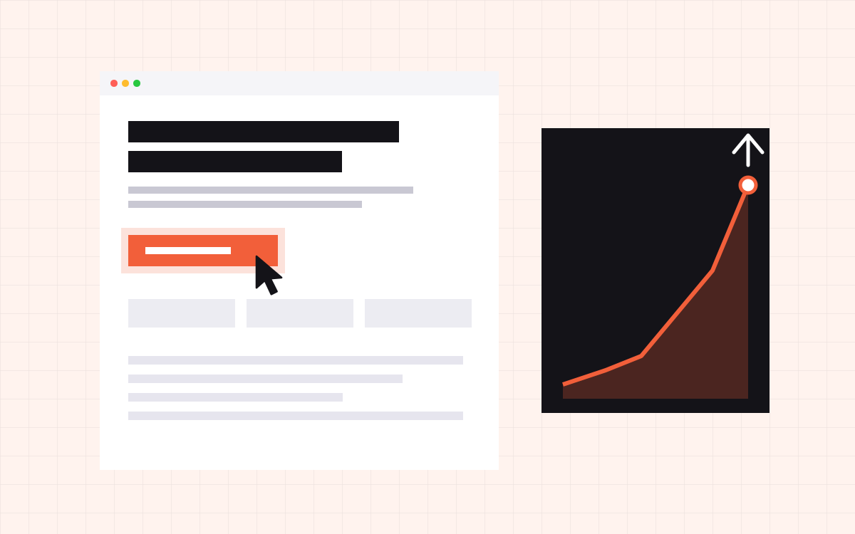
- A landing page converts when it has one goal, matches the message that brought the visitor there, and removes every reason not to act.
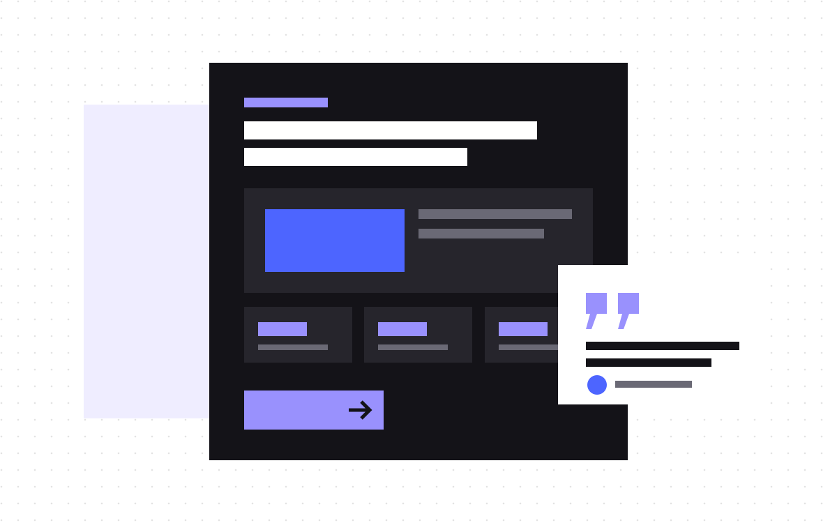
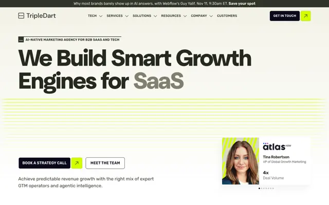
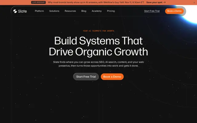
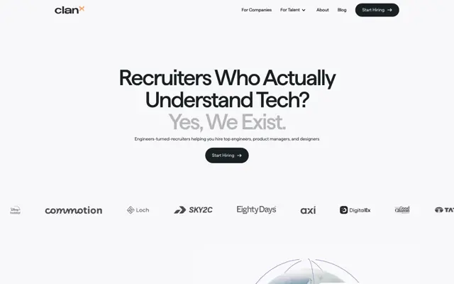
- The hero does most of the work: a specific headline, a short line of support, a clear visual and one obvious button.
- Proof and objection handling come next. Show who uses you, answer the doubts people have, and make the next step feel small.
- Short forms, fast loading and a clean mobile layout matter as much as the design.
- Treat launch as the start. Watch the data, test one change at a time and keep what works.
How to design a landing page that converts: the short answer
A landing page that converts has one goal, one audience and one message that matches the ad, email or search that brought the visitor there. It states the offer in a specific headline, backs it up with proof, answers the main objections, and makes the next step as small and clear as possible. Then it loads fast, works on a phone and gets improved with real data after launch.
We build landing pages for product launches, paid campaigns, events, waitlists and new services. Our landing page price is $500 and most take about a week, so we have refined a process that works fast without skipping the parts that matter. This is that process, step by step.
It is not a list of design tricks. Colour of the button and size of the font matter far less than whether the page says the right thing to the right person.
Step 1: Pick one goal and one audience
A home page has to serve everyone. A landing page does not. That is its strength. Before any design, we write down two lines:
- The goal. Book a demo, start a trial, join a waitlist, download a guide or register for an event. One action, not three.
- The audience. Who is arriving and what they already know. A visitor from a search ad about a specific problem needs a different page from someone clicking a link in your newsletter.
Everything on the page then gets one test: does this help this person take this action? Navigation menus, links to the blog and extra offers usually fail the test. We remove most of the main navigation on campaign pages so attention stays on the goal.
Step 2: Match the message that brought them
If an ad says "Cut your month end close to three days", the landing page headline should talk about cutting month end close, not about "the modern finance platform". When the page does not match what was promised, visitors feel they clicked the wrong thing and leave.
Message match covers more than the headline:
- Use the same words and the same offer as the ad or email.
- Keep the visual style close, so the click feels like a continuation.
- If the ad mentions a price, a discount or a free trial, show it near the top.
- For search campaigns, use the phrase people typed in the headline or the first lines.
This is why one landing page per campaign or audience often beats one generic page for everything. Our section library setup makes it quick for teams to spin up variations without a new build each time.
For email and social traffic, message match also means tone. A warm newsletter link should land on a page that feels like the same voice, not a stiff corporate page. For retargeting ads, the visitor already knows you, so the page can skip the basics and go straight to the offer and proof.
Step 3: Write the hero first
Most visitors decide whether to stay within a few seconds, based on what they see before they scroll. So we write and design the hero before anything else.
- Headline. The outcome the visitor wants, said specifically. "Hire vetted designers in 48 hours" beats "Talent, reimagined".
- Supporting line. One or two sentences on how, or for whom.
- Visual. The product, the result or the person, not abstract shapes. A real screenshot often outperforms a polished illustration.
- Primary button. A clear action in the visitor's words, like "Book a 20 minute demo" rather than "Submit".
- A trust cue. A few logos you have permission to use, a rating or a short line like "No credit card needed".
If the hero only works with the rest of the page, it does not work. Read it on its own and ask: would I know what this is and what to do next?
Step 4: Build the case below the fold
People who scroll want more reasons. We usually order the sections like this, adjusting for the offer:
- The problem. Show you understand the pain in the visitor's own words.
- How it works. Three simple steps. Keep it short and visual.
- Key benefits. Three to five outcomes, each with a short proof point or product detail.
- Proof. A testimonial, a case study snippet or numbers you can stand behind.
- Objections. An FAQ that answers price, time, risk, setup and switching questions.
- Final call to action. Repeat the offer and the button, with a reminder of what happens next.
Every section should move the visitor closer to the action. If a section is only there because "landing pages usually have one", it can go.
The order is not fixed. For a product people already know, proof and pricing can come earlier. For a brand new category, the problem and how it works need more space. We decide the order from the questions this audience is most likely to ask, in the order they are likely to ask them.
Step 5: Use proof that is real and specific
Generic praise like "Great team, highly recommend" does little. Specific proof works much better: a named person, their role, their company and what changed for them. A short quote placed next to the claim it supports is stronger than a slider of ten quotes at the bottom.
Only use logos, names and numbers you have permission to share. Visitors can tell when proof feels thin, and a made up stat can cost you far more trust than it ever wins. If you are early and have little proof, lean on specifics instead: how the process works, what is included, who is behind it and what guarantee or trial you offer.
Where you place proof matters too. Put a short quote or a logo row right under the hero, a case study snippet next to the benefit it supports, and a reassurance line next to the form. Each piece of proof should answer the doubt the visitor is likely to have at that point on the page.
Specific beats impressive. A small true number persuades more than a big vague one.
Step 6: Remove friction from the action
Small bits of friction add up. We look hard at the moment of action:
- Form length. Ask only for what you need now. Name, work email and one qualifying question is often enough. You can ask the rest later.
- Labels and errors. Clear labels, helpful error messages and no field that clears itself when something is wrong.
- What happens next. Say it under the button: "We reply within one working day" or "You will pick a time on the next screen".
- Booking. For demos, a booking tool embedded on the page or right after the form removes the back and forth of email.
- Thank you page. Confirm it worked and offer one useful next step.
Then we test the whole flow on a phone, end to end, including the email or calendar invite that arrives after.
Step 7: Make it fast and mobile first
For paid campaigns, a large share of clicks come from phones, often over average connections. A slow page wastes ad spend before the visitor even sees the offer.
- Keep the hero light. Compress images and keep video out of the first screen unless it is small.
- Limit fonts and third party scripts. Each tracking tag adds weight.
- Design the mobile hero on purpose: headline, line, button, visual. The button should be visible without scrolling.
- Make tap targets big enough and keep forms easy to fill on a small screen.
We check every landing page on a real phone and with PageSpeed Insights before launch. Our guide on Webflow interactions that stay fast covers motion in detail.
Writing the copy: words that do the selling
Design gets attention, but copy does most of the persuading on a landing page. We write the words before we design the layout, so the design serves the message rather than the other way round.
- Write to one reader. Picture the person arriving from that ad or email and write as if you are talking to them across a table.
- Lead with outcomes. "Close your books in three days" is stronger than "Automated reconciliation engine". Add the feature as the reason the outcome is possible.
- Use their words. Sales calls, support tickets and reviews are full of the exact phrases buyers use. Borrow them.
- Be specific. Numbers, time frames and concrete examples are easier to believe than adjectives.
- Cut hard. Every sentence should earn its place. If a line could appear on a competitor's page unchanged, rewrite it or delete it.
- Make buttons say what happens. "Get the guide", "Book my demo" or "Start free trial" beat "Learn more" and "Submit".
Read the finished page out loud. Anywhere you stumble or get bored, the visitor will too. That simple test catches more weak copy than any checklist.
Step 8: Track, test and improve
A landing page is never finished at launch. It is a starting point you improve with data.
- Set up tracking first. Track form submissions, button clicks and bookings as conversions, with campaign source attached. Our analytics and tracking work covers this.
- Wait for enough traffic. Do not judge a page on a handful of visits.
- Look for the biggest leak. Do people leave in the hero, or scroll and not click, or start the form and quit?
- Test one change at a time. Headline first, usually. Then the offer, then the proof, then the form.
- Keep a log. Write down what you changed, when and what happened. It stops you repeating failed ideas.
Session recordings and heatmaps help you see where people get stuck. Use them to form ideas, then test those ideas properly.
Small pages with modest traffic may never reach clean statistical results. That is fine. In that case, make bold changes based on clear evidence, such as a confusing headline or a form most people abandon, and compare results over a few weeks rather than chasing tiny percentage gains.
Landing page mistakes we fix most often
- Sending ads to the home page. The visitor has to hunt for the offer they clicked on.
- A clever headline nobody understands. Clarity wins over wit almost every time.
- Too many choices. Three buttons for three different actions split attention.
- Long forms on the first step. Twelve fields for a demo request scares off good leads.
- No proof near the action. Testimonials sit far away from the button.
- Broken tracking. The page might be working, but nobody can tell.
- Slow mobile load. Heavy hero media on a paid campaign page.
How we build landing pages at Kookies
A Kookies landing page is $500 and usually takes about a week. We start with a short brief on the goal, audience and traffic source, then write and design the hero first, build the page in Webflow or Astro, connect forms and tracking, and test on phones before launch. If you want copy help, our strategy and copywriting team can write it with you.
Every project includes 30 days of support after launch for safe changes, like copy, image, colour and link updates, and fixes to what we built. Bigger changes, like new sections or test variations, can be quoted or covered by our care plan. See our landing page service for examples, or see all pricing.

Terms used: Landing page, Conversion rate