

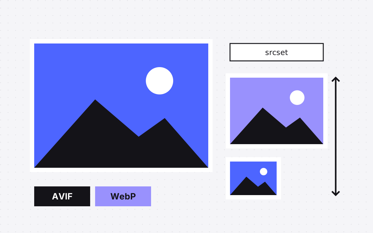
- Webflow can convert JPEG and PNG assets to AVIF or WebP from the Assets panel or the Collections panel. It replaces the originals, so back them up first.
- Use WebP, not AVIF, for Open Graph images. Webflow's help says AVIF is not widely supported there.
- Webflow makes responsive sizes for images uploaded in Webflow, but not for images added by CSV import or the API, in rich text, or as backgrounds.
- New images lazy load by default. Set the main image in the first screen to load eagerly.
- Set alt text once on the asset, override it where context changes, and mark decorative images as decorative.
The short answer
In Webflow, upload images at roughly twice the size they will display, convert JPEG and PNG assets to AVIF or WebP with the built-in conversion tool, and let Webflow create responsive sizes. Keep lazy loading on for images below the first screen, and switch the main image at the top of the page to eager. Give every meaningful image alt text and mark decorative ones as decorative. Use WebP, not AVIF, for social share images.
Webflow does much of this for you, but each feature has gaps. The rest of this post shows where they are.
Which format for which image
| Image | Format | Why |
|---|---|---|
| Photos and screenshots | AVIF or WebP | Smaller files at similar quality |
| Social share (Open Graph) images | WebP or JPEG | Webflow's help says AVIF is not widely supported for Open Graph |
| Logos, icons, simple drawings | SVG | Sharp at any size, tiny files |
| Images with fine detail that must stay exact | PNG | Lossless |
| Images for email | JPEG or PNG | Webflow notes AVIF and WebP are not supported in every email client |
Webflow's own help recommends SVG and PNG for high-detail or vector images, since their compression is lossless.
Converting to AVIF or WebP in Webflow
Webflow's image conversion tool converts JPEG, JPG and PNG assets to AVIF or WebP. You can run it in two places:
- Assets panel. Expand the panel, select the assets, choose AVIF or WebP, then Compress.
- Collections panel. Use the more options menu, then Compress assets, to convert the images in your CMS Collections.
Read these points first, all from Webflow's help page:
- The converted file replaces the original, on the canvas too. You can't convert back inside Webflow. Download the originals or make sure a site backup has them.
- There are batch limits per request and per minute. Convert very large images one at a time.
- An image that is already compressed as far as it goes may fail to convert. That is fine.
- Republish the site after converting.
Webflow also accepts AVIF uploads directly, so you can convert files before upload if you prefer to keep control of quality.
Responsive sizes: what Webflow makes for you
When you upload an image in Webflow, it creates smaller versions and adds srcset and sizes to the image, so a phone downloads a small file and a large screen a large one. Webflow's help says an image wider than 3200px gets seven versions, from 500px up to 3200px.
It does not do this for:
- Images added through a CSV import or the API. Size and compress them before import, or upload them in Webflow.
- Images inside rich text elements.
- Background images.
Two more details. Webflow measures images as you work, so after changing a shared class or component, press Command + Shift + I on Mac or Control + Shift + I on Windows to re-measure every page. And sizes are based on an image's normal state, not on hover states or interactions that make it bigger, so check those by eye.
What size to upload
Upload at about twice the largest size the image will display, so it stays sharp on high-density screens. A hero that shows at 1440px wide needs a file around 2880px wide. A card image that shows at 400px needs about 800px. Bigger than that only adds weight to your assets.
Webflow's help page on responsive images gives a file size limit for uploads. Check the current number there before you upload large photos.
A quick way to find the display size: open the published page on a wide screen, right-click the image, choose Inspect and read the width it renders at. Do the same at tablet and phone widths; an image that spans the full width on a phone may need more pixels there than you expect.
For background images, which get no responsive versions, keep files small. An image element with object fit set to cover often gives the same look with responsive sizes included.
Lazy loading, and when to turn it off
Webflow sets new images to lazy load by default, which means they load when they come into view. You can change it per image in the image settings. Webflow's update on this notes two limits: it applies to inline images, not background images, and it did not change images that were already on a site.
Turn lazy loading off, set to eager, for the main image in the first screen of a page, such as the hero image. That image is often the page's largest content paint, and lazy loading it makes it start later. Leave everything below the fold on lazy. Our Core Web Vitals on Webflow post covers LCP in detail.
Alt text in Webflow
Webflow lets you set alt text in two layers:
- On the asset, in the Assets panel. Every use of that image gets it by default.
- On one image, in the image settings, choosing a custom description. Use this when the same image means something different in a new place.
You can also mark an image as decorative so screen readers skip it. Webflow's tip for deciding: remove the image. If information is missing, it needs alt text. Logos, images that are links or buttons, and images with key information always do.
For CMS images, set alt text through the CMS. Webflow's Audit panel does not check alt text on CMS-bound images or images inside Lightbox elements, so these slip through. Text baked into an image cannot be read by screen readers or search engines; put important words in real text.
An image check before launch
- Photos converted to AVIF or WebP, originals saved somewhere safe.
- Social share images in WebP or JPEG, including any CMS Open Graph image field.
- Logos and icons as SVG.
- No image uploaded at more than about twice its display size.
- Images imported by CSV or API sized before import.
- Hero image set to eager, the rest lazy.
- Background images small, or swapped for image elements.
- Alt text on every meaningful image, CMS images included; decorative ones marked.
- Responsive images re-measured after design changes.
- Site republished, then tested on a phone on a slow connection.
What to do next
Start with your heaviest pages: run them through PageSpeed Insights, look at the image items, and fix those first. Our Webflow site speed post covers the rest of the speed work. If you want us to take it on, see Webflow development or the care plan, or send us the page.