
Call to action, explained
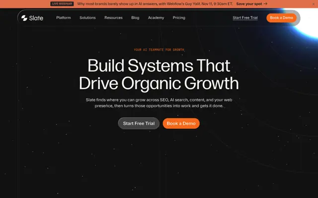
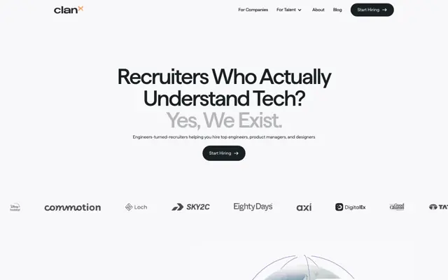
Each page should have one main action. Several equal buttons make people hesitate, so make one stand out and keep the rest quieter.
Clear wording beats clever wording. Say what happens next and, where you can, what they get: See pricing tells more than Learn more.
Place it where the decision happens. Early in the page for people who already know, and again after the proof for people who needed convincing.
Text near the button can remove the last doubt, such as no card needed or how long the call takes. Only say what is true.