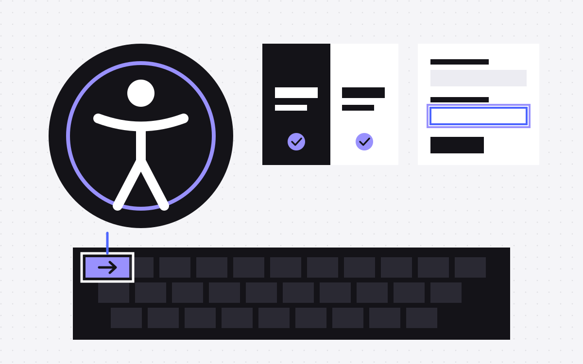
- Accessibility means people with disabilities can use your site. It also makes the site easier for everyone.
- WCAG is the common standard, and many teams aim for level AA.
- The usual problems on SaaS marketing sites are low contrast, keyboard traps, poor forms and unlabelled menus or demos.
- Automated tools only catch part of it. Test with a keyboard and a screen reader as well.
- This is general information, not legal advice. Ask a qualified adviser what applies to you.
The short answer
Website accessibility means that people with disabilities can perceive, understand and use your site, including people who use screen readers, keyboards, zoom or captions. For a SaaS site, the basics are good contrast, full keyboard use, clear headings, labelled forms, useful alt text and motion that people can control.
This article is general information, not legal advice. Whether a law applies to your business depends on where you operate and who you sell to, so ask a qualified adviser.
Why SaaS teams should care
- People. Your buyers and users include people with disabilities, some permanent and some temporary.
- Sales. Larger buyers may ask about accessibility in security or procurement reviews.
- Law. Rules such as the ADA in the US and the European Accessibility Act in the EU may apply to some businesses. How they apply varies, so get advice.
- Quality. Clear headings and clean structure also help search engines and AI tools read a page.
WCAG in plain words
WCAG, the Web Content Accessibility Guidelines, is a technical standard from the W3C. The latest version is 2.2. It has four principles:
- Perceivable. People can see or hear the content, or get it in another form. For example, alt text and captions.
- Operable. People can use it, for example with only a keyboard.
- Understandable. Content and controls are clear and behave as expected.
- Robust. It works with assistive tools such as screen readers.
Each rule has a level: A, AA or AAA. Many teams aim for AA. W3C also keeps a list of how laws around the world refer to WCAG, which is a useful start for a talk with your adviser.
Colour and text
- Contrast. For level AA, normal text needs a contrast ratio of at least 4.5 to 1 with its background, and large text at least 3 to 1. Grey text on white and white text on brand colours are the common failures.
- Do not rely on colour alone. A red border on a form field also needs an icon or a message.
- Text over images. Check it at each breakpoint, since the image moves behind it.
- Zoom. The page should still work at 200 percent zoom, with nothing cut off.
Keyboard and focus
Put your mouse aside and press Tab through your homepage. It is the fastest test there is.
- Can you reach and use every link, button and menu?
- Can you always see where the focus is? Many sites remove the focus outline for looks. Replace it, do not just remove it.
- Is the order sensible?
- Do dropdown menus open with a keyboard?
- Can you close popups and modals with the keyboard, and does focus return to where it was?
- Is there a skip link to the main content?
Headings, links and images
- Headings. Use one H1 and a logical order. Do not choose a heading level because of how it looks. Screen reader users often move around by headings.
- Links. "Learn more" repeated ten times tells a screen reader user nothing. Make the link text specific, or add a hidden label.
- Alt text. Describe images that carry meaning. Mark decorative images as decorative. See alt text.
- Language. Set the page language, so screen readers use the right voice.
Forms
Your demo and signup forms are where accessibility meets revenue.
- Each field has a real, visible label. A placeholder is not a label.
- Errors say what went wrong and how to fix it, next to the field.
- Required fields are clear, and not only by colour.
- Autocomplete works for name and email fields.
- Any custom dropdown or date picker works with a keyboard and a screen reader.
- Any spam check has an accessible option. Puzzles can block real people.
Problems that are common on SaaS sites
- Product screenshots. A screenshot with important text needs a text version nearby or a good description.
- Autoplay demos and looping animation. Let people pause moving content, and respect the
prefers-reduced-motionsetting. Long, flashing or fast motion can make some people unwell. - Pricing toggles and tabs. Make sure the state change is announced, and that they work with a keyboard.
- Comparison tables. Use real table markup, and do not use icons with no text for "yes" and "no".
- Mega menus. Hover-only menus lock out keyboard users.
- Videos. Add captions, and transcripts where you can.
- Third-party widgets. Chat tools, cookie banners and embedded forms are part of your site for the visitor. Test them too.
- Small tap targets. WCAG 2.2 at level AA asks for a minimum target size of 24 by 24 CSS pixels, with some exceptions.
How to test
- Automated scan. Run Lighthouse or axe on your key pages. These tools find some problems but not all, so a good score does not mean the site is accessible.
- Keyboard. Tab through your homepage, pricing page and demo form.
- Screen reader. Try VoiceOver on a Mac or NVDA on Windows. Even a short try will teach you a lot.
- Zoom and small screens. Try 200 percent zoom and a phone.
- Real people. For bigger sites, pay for an expert audit and testing with disabled users.
Accessibility on Webflow
Webflow gives you real HTML control, so you can build an accessible site, or an inaccessible one. The Designer's Audit panel flags issues such as missing alt text, unclear link text and skipped heading levels. It has limits, for example with CMS-bound images, and it does not check colour contrast. Webflow's colour picker has a contrast checker for that.
On any platform, the most effective step is to build accessibility into your components, so editors get it right by default. Custom interactions and code need testing, as these are where problems tend to appear.
A word on overlay widgets
Some tools add a widget to your site that promises to fix accessibility with one line of code. Be careful about relying on one. A widget cannot fix every problem in your content and markup, and it should not replace fixing the site itself. If a vendor makes compliance claims, ask your adviser to review them.
What to do next
- Run the keyboard test on your three most important pages today.
- Fix contrast and form labels first. They are often quick wins.
- Add accessibility checks to your design and release process, so it does not slip back.
- Consider publishing an accessibility statement that honestly says what you aim for and how to report a problem.
We aim for WCAG level AA as part of our design and development work, but we do not give legal advice and cannot promise compliance. Ask us to look at your site. For more, see the launch checklist.

Terms used: Accessibility (WCAG), Webflow