

- Buyers reading a comparison page have often already shortlisted you, so honesty does more than hype.
- Build a page only when buyers really ask about that rival and you can back each claim.
- Say who should pick the other option. It is the line that makes the rest believable.
- Keep a source and a check date for every fact about a rival, and give the page an owner.
- Rules on naming rivals differ by country. Get advice for your market, because this is not legal advice.
The short answer
An X vs competitor page converts when it helps the buyer decide, not when it attacks. Open with a clear answer, say who each option suits, compare on points you can back up, admit where the rival is better, and offer one next step. Only write claims you could defend with a source. If you have no real difference from that rival, do not build the page.
We cannot give you a conversion figure for this format, and be wary of anyone who quotes a universal one. What follows is how we build our own comparison pages, and why.
Who reads these pages
Someone searching for one product against another usually knows the category and has a shortlist. They do not need your category explained. They want to know three things: what is the real difference, which fits a team like mine, and what is the catch.
That changes the job of the page. It should read like advice from someone who knows both, not like a sales sheet. A reader can check your claims in a new tab, and many will.
Which pages to build
Answer these before you write a word.
| Question | If yes | If no |
|---|---|---|
| Do buyers or sales calls name this rival? | Keep going | Skip it, whatever the keyword tool says |
| Is there a real difference for some buyers? | Keep going | Fix your positioning first |
| Have you used the rival, or can you test it? | Write it | Test first, or stick to public facts |
| Will someone keep it up to date? | Publish | Do not publish |
Start with the rival your sales team hears about most. These pages also belong in the wider plan for the pages a SaaS site needs.
The page outline we use
Our comparison pages share one structure, and you can copy it.
- Plain heading and lead. Name both products and say what the page settles.
- Quick answer. Two or three sentences that give the verdict, usable on their own.
- Pick this if. Two lists side by side, one for each option, with a link for each.
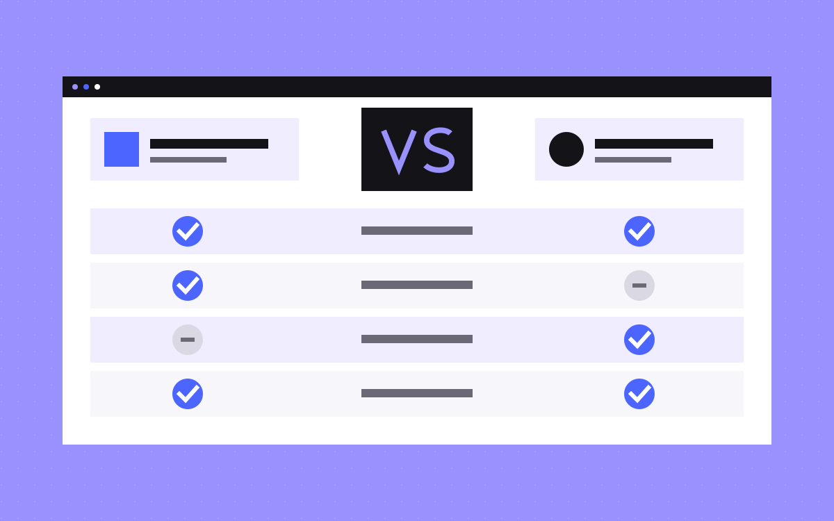
- Comparison table. Rows that buyers care about, with a short plain answer in each cell, not only ticks.
- Guide. A longer read on the differences that take explaining.
- FAQ. The questions people really ask, answered in a line or two.
- Next step. A call to action that matches the reader's stage.
See Webflow vs Framer for a live version.
Say who should pick the other one
This is the part most comparison pages leave out, and we think it does the most work. Our Webflow vs Framer page says Framer is the faster tool for a small, design led site or a launch page that needs to go live this week. We build on both, so that is simply our honest view.
The harder case is when the rival is another way to hire us. On agency vs freelancer, we say to hire a freelancer for a small, clearly scoped job on a tight budget where a short delay is fine. The table lists a freelancer as the lowest cost. It would be strange to claim otherwise, and readers know it.
Giving up a few readers this way costs little, since they were never a fit. The readers who remain have a reason to believe the rest of the page.
A test for every claim
Run each sentence about a rival through this table.
| Claim type | Example | What to do |
|---|---|---|
| Vague praise | We are better and easier | Replace it with the specific difference |
| Measured | Our pages load faster | Show how you tested, or cut it |
| Feature | They have no staging | Link to their docs and record the check date |
| Price | They cost more | Link to their pricing page, or say it changes and leave it out |
| Opinion | We find their editor harder for new staff | Fine, if you label it as your view and explain why |
| Rumour | Their support is getting worse | Cut it |
| Their customers | Teams are leaving them | Cut it, unless you can name and show it |
Also keep the same standard for yourself. If you list their weak points, list yours. Do not hide your own limits in the small print.
Keep a claims log
Rival products change, and a wrong fact on your page is your problem. Keep one sheet for each page.
- Each factual claim about the rival.
- The source link, ideally their own docs or pricing page.
- The date someone last checked it.
- Who checks it next.
Review it on a set schedule, and whenever the rival announces something big. When you could not read a fact on the rival's own site, leave it out. We follow that rule on our own comparisons: where we could not read a vendor's pricing page, the page quotes no price.
The legal side, in plain words
This is not legal advice, and rules differ by country, so ask a qualified person in your market before you publish. As one reference point, the US Federal Trade Commission's statement on comparative advertising encourages naming competitors, but requires clarity and, where needed, disclosure so buyers are not deceived. The published text says disparaging ads are allowed only when truthful and not deceptive. Other places can be stricter, and trademarks are a separate question, so do not assume the US view applies to you.
Do not use a rival's logo as if they endorse you, and do not copy their screenshots or text without checking your rights to do so.
Help search and AI tools read it
Good structure helps here too. Open each section with a direct answer, and keep real text in the table instead of icons alone. Google's guidance on high quality reviews is written for reviews, but it fits well: show first-hand evidence, cover the benefits and the drawbacks, and explain which option suits which use. No page format guarantees rankings or citations.
Common mistakes
- A table of ticks where you win every row. Readers stop believing it at once.
- Rows chosen to flatter you. Pick the points buyers ask about, including ones where you lose.
- One call to action for everyone. Our agency page offers a call and also a route to prices, because not everyone is ready to talk.
- Old facts. The rival shipped the feature two years ago, and your page still says they lack it.
- Publishing dozens at once. A thin page for each rival adds little. Start with the two or three that come up in calls.
What to do next
Ask your sales team which name comes up most, and draft the quick answer for that rival in three sentences. If you cannot write it honestly, you have learned something about your positioning. Browse our comparison pages for the format, or see our strategy and copywriting work if you want help. You can also send us your draft.

Terms used: Landing page, Core Web Vitals