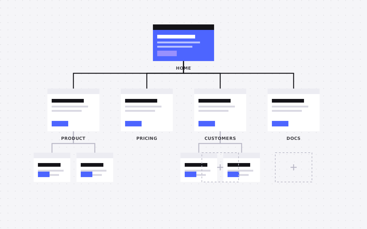
- Every SaaS website needs a home page, product or feature pages, pricing, customers, about, contact or demo, a blog and the legal pages. That is the core.
- As you grow, add use case or industry pages, comparison pages, integrations, security and trust, changelog and careers.
- Each page should answer one buyer question clearly. If a page does not answer a question someone actually asks, cut it.
- Pricing, security and comparison pages are where serious buyers decide. Many SaaS sites under invest in all three.
- Plan the CMS early so your team can add case studies, integrations, jobs and posts without a developer.
The pages every SaaS website needs: the short answer
Every SaaS website needs eight core pages: a home page, product or feature pages, pricing, customers or case studies, about, a demo or contact page, a blog, and legal pages like privacy and terms. As the company grows, add use case or industry pages, comparison pages, an integrations directory, a security page, a changelog, and careers. Each page should answer one question a buyer is actually asking.
That list sounds obvious. Yet when we audit SaaS sites, the same gaps show up again and again. Pricing that says "contact us" with no context. No page that explains how the product compares to the tool the buyer already uses. A security page that is one paragraph long. Case studies hidden three clicks deep.
This guide walks through each page, what it needs to do, and what we put on it when we build SaaS sites for teams like ClanX and Petavue.
Start from buyer questions, not a template
A SaaS buyer moves through a set of questions before they sign up or book a demo. Your sitemap should map onto those questions:
| Buyer question | Page that answers it |
|---|---|
| What is this and is it for me? | Home page |
| How does it work and what can it do? | Product and feature pages |
| Does it fit my team or industry? | Use case and industry pages |
| How is it different from what I use now? | Comparison pages |
| Does it work with my tools? | Integrations |
| Who else uses it, and did it work? | Customers and case studies |
| What will it cost? | Pricing |
| Is it safe to buy? | Security and trust |
| Who is behind it? | About and careers |
If a page on your site does not answer a real question, it is probably noise. If a question has no page, that is a gap your sales team is filling by hand on every call.
Home page
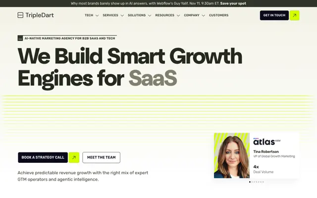
The home page has one job: help the right visitor understand what you do and take a next step within a few seconds. It is not a place to list every feature.
- Headline. What the product does and for whom, in plain words. Skip slogans that could fit any company.
- Product visual. A real screenshot or a short, clear animation of the product doing its main job.
- Proof near the top. Customer logos you have permission to use, a short quote or a key number you can back up.
- Three to five value points. Outcomes, not feature names.
- How it works. Three simple steps.
- One main call to action, repeated, with a lower commitment option for people not ready to talk.
Write the headline last. It is easier once the rest of the page has forced you to be specific.
Then check the page on a phone. The headline, a short line and the button should all appear before any scrolling, and the product visual should still be readable at that size.
Product and feature pages
Product pages explain how the software works. Early on, one strong product page may be enough. As the product grows, split it into pages for each major feature or module.
A good feature page answers four things: what problem this feature solves, how it works step by step, what it looks like in the real product, and what result the customer gets. Add a short FAQ for the questions sales hears most often about that feature.
Feature pages are also strong search pages. People search for the job they want done, like "automate invoice approvals" or "track candidate pipeline". A page built around that job, with clear headings and a plain answer near the top, can rank and get cited by AI tools. Our guide to AEO explains how to write them.
Pricing page
Pricing is one of the most visited pages on any SaaS site, and one of the most important for conversions. Even if you sell enterprise deals, a pricing page with real structure helps buyers qualify themselves.
- Show plans side by side with clear names and who each plan is for.
- Show prices where you can. If enterprise is custom, say what drives the price, such as seats or usage.
- Add a comparison table of features by plan, with plain names.
- Answer billing questions: monthly or annual, trials, cancellation, refunds.
- Add a pricing FAQ. It catches objections before they become support tickets.
Hiding all pricing behind "contact sales" often filters out good leads who just wanted a rough idea. A range or a starting price is usually better than silence.
Pricing pages also attract a lot of search and AI questions, like "how much does your product cost" or "does it have a free plan". A short answer at the top of the page, followed by the plan details, gives search engines and AI tools a clear fact to quote. Keep the page updated whenever prices change. An outdated price that gets quoted back to a prospect causes awkward sales calls. If you have a free trial or a free plan, say exactly what is included and what happens when it ends.
Use case, industry and comparison pages
These pages are where a SaaS site starts to grow beyond the basics, and where a lot of high intent search traffic lives.
Use case and industry pages
A use case page speaks to a specific job or team, like "for recruiters" or "for finance teams". An industry page speaks to a sector, like healthcare or fintech. Each should use the words that audience uses, show relevant features first and include proof from similar customers where you have it.
Comparison pages
Buyers search for "your product vs competitor" and "competitor alternatives" when they are close to a decision. If you do not have a page for that search, someone else will rank for it. Keep comparisons fair and factual. Say where the other tool is strong. Buyers trust honest comparisons, and AI tools are more likely to quote them.
See how we structure these for clients in our SaaS industry page.
Customers and case studies
Case studies turn claims into proof. A good SaaS case study follows a simple shape: who the customer is, what problem they had, what they tried before, how they use the product and what changed. Use real numbers only when the customer has agreed to share them.
Put case studies in a CMS collection with fields for industry, team size and use case. Then you can show the right story on the right page, such as fintech stories on the fintech page. A customers page that lists logos and links to stories is also worth having, because buyers often look for a company like theirs before anything else.
Short quotes work well across the site too. Place them next to the feature or claim they support, not all together in one slider at the bottom.
Integrations, security and trust pages
For B2B buyers, these pages often decide whether a deal moves forward.
- Integrations. A directory of the tools you connect with, each with a short page that explains what the integration does. Build it as a CMS collection so adding a new one takes minutes. These pages also rank for searches like "your product plus tool name".
- Security. Explain how you protect data in plain words: hosting, encryption, access control, backups and any certifications you actually hold. Offer a way to request security documents. Never claim a certification you do not have.
- Status and changelog. A changelog shows the product is alive and improving. A status page shows you are open about uptime.
A thin security page makes procurement slower. A clear one saves your team many emails.
About, careers, blog and the small pages
The rest of the sitemap supports trust, hiring and long term search traffic:
- About. Why the company exists, who runs it and where you are based. Real faces help.
- Careers. Open roles in a CMS, with a clear picture of how the team works. Candidates read your whole site, not just the jobs page.
- Blog or resources. Answer-first guides on the problems your buyers search for. Keep it focused on your product's world.
- Demo or contact. A short form or a booking link, with what happens next written clearly.
- Legal. Privacy policy, terms, cookie notice and a data processing agreement if you sell to companies.
- 404 page. Friendly, with links to the most useful pages.
Navigation and footer: how the pages connect
Having the right pages is half the job. Visitors also need to find them. SaaS navigation tends to grow messy as pages get added, so plan it on purpose.
- Keep the top menu short. Product, Solutions or Use cases, Customers, Pricing and Resources covers most SaaS sites. Put the main call to action, like "Book a demo" or "Start free", on the right, always visible.
- Use dropdowns to group, not to hide. A Product menu can list features with one line each. A Solutions menu can split by team and by industry.
- Make pricing one click away. Buyers look for it early. Hiding it under a menu costs you trust.
- Use the footer as a full map. Link every important page, including security, integrations, comparisons, careers and legal pages. Search engines and people both use it.
- Link between pages in the content. Feature pages should link to related use cases, case studies and integrations. These links help visitors and spread authority across the site.
Test the navigation with someone outside the company. Ask them to find pricing, a case study in their industry and the security page. If they hesitate, the menu needs work.
A starting sitemap and what to build first
You do not need every page on day one. Here is the order we usually recommend:
- Launch: home, one product page, pricing, about, demo or contact, legal pages, blog set up with two or three posts.
- First quarter after launch: two or three case studies, a security page, a careers page.
- As you grow: feature pages per module, use case and industry pages, comparison pages, an integrations directory, a changelog.
Plan the CMS for the later stages from the start, even if the collections are empty. Adding a case studies collection on day one costs almost nothing. Retrofitting one later often means rebuilding pages. Our Webflow CMS guide shows how we plan collections.
At Kookies, a website of up to 5 pages starts at $2,500 and usually takes 3 to 5 weeks. A large site of 6 or more pages starts at $3,000. A single landing page for a launch or campaign is $500.
How we build SaaS websites
We start every SaaS project with the buyer questions above, then turn them into a sitemap and wireframes before any visual design. Copy comes early, because a SaaS page lives or dies on how clearly it explains the product. Our strategy and copywriting work covers this if you need help with words.
Then we design in Figma and build in Webflow or Astro and Sanity, with the CMS set up so your team can add case studies, integrations, jobs and posts on their own. Every project includes 30 days of support after launch for safe changes, like copy, image, colour and link updates, and fixes to what we built.

Terms used: Sitemap, Pricing page