
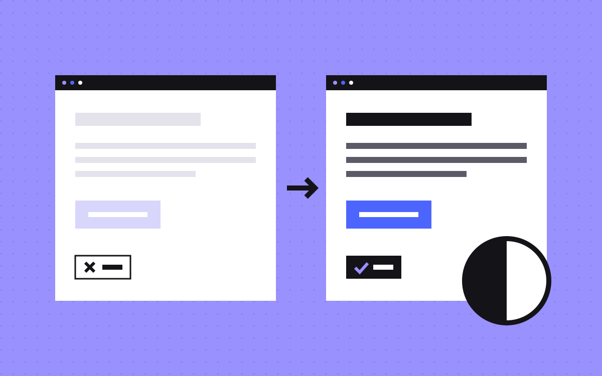
- WCAG level AA asks for a contrast ratio of at least 4.5:1 for normal text and 3:1 for large text, which is 18 point or 14 point bold.
- Brand colours are not an exception. Only logos, pure decoration and inactive controls are exempt. Placeholder and hover text count.
- Find failures with a Lighthouse accessibility report or the CSS Overview panel in Chrome DevTools, then check menus, forms and dark mode by hand.
- Most fixes are small: a slightly darker grey, dark text on a light brand button, a solid layer behind text on a photo.
- In Webflow, check the ratio in the colour picker and fix the colour variable once so every page updates.
The short answer
Low contrast text is text that is too close in brightness to its background. To fix it, measure it, then darken the text or change the background until it passes. WCAG level AA asks for a contrast ratio of at least 4.5:1 for normal text and at least 3:1 for large text. Find the failures with a Lighthouse report or the CSS Overview panel in Chrome DevTools, then fix the colour once at the source, such as a colour variable, so every page updates.
In most cases the fix is a slightly darker grey, a darker button colour or a solid layer behind text on an image. The design keeps its look. More people can read it.
The numbers, and what is exempt
The rule is WCAG Success Criterion 1.4.3, Contrast (Minimum), at level AA. W3C's page on the criterion sets it out:
- Normal text: a contrast ratio of at least 4.5:1.
- Large text: at least 3:1. Large means 18 point, or 14 point bold. W3C gives these as about 24px and about 18.5px.
- No rounding. The ratios are thresholds. W3C's example: 4.499:1 does not meet 4.5:1.
The ratio compares how light the text is with how light the background is. Hue is not a key factor in the sum, so a red and a green of similar lightness can still fail. For the term itself, see colour contrast and WCAG in our glossary.
Thin fonts need extra care. W3C notes that very thin type can render fainter than its CSS colour, so text that passes on paper can still be hard to read. Pick a heavier weight or go past the minimum.
What is exempt, and what is not
W3C lists a short set of exceptions:
- Text that is part of a logo or brand name.
- Text that is pure decoration.
- Text in an inactive control, such as a disabled button.
- Text that happens to be in a photo with other significant visual content, such as a street sign.
Two things people expect to be exempt are not:
- Brand colours. W3C says text that has low contrast because of brand guidelines is not exempt, beyond logos.
- Placeholder and hover text. The rule covers placeholder text and text shown on hover or keyboard focus.
A disabled button is exempt, but people still need to tell what it is. Keep its label readable where you can.
How common is it
Very. In our own study, How accessible are the home pages of top cloud companies?, we ran Lighthouse's accessibility audit on every home page in the Forbes Cloud 100, checked 16 November 2026. The findings: 46% have text with low contrast, the most common failed check. That is on pages where the median accessibility score is 93 out of 100.
So a high score does not mean the text is readable. Contrast is the check good teams miss most often.
How to find low contrast text
Chrome DevTools has the tools built in. Chrome's guide to readable text lists these ways to get every contrast issue on a page:
- Lighthouse report. Open DevTools, open the Lighthouse panel, tick Accessibility and analyse the page. The report has a Contrast section with a list of affected elements. Click one to jump to it.
- CSS Overview. Open the CSS Overview panel and capture an overview. In the Colors section, open Contrast issues. You get each failing pair of text and background colour.
- Inspect one element. Turn on Inspect and hover over text. The tooltip shows the contrast ratio, with a warning sign when it is too low.
Chrome also has an Issues tab option for contrast, but the guide marks it as a preview feature that is off by default.
Automated checks only see a page in its first state. Open the menu, focus a form field, hover the buttons and switch to dark mode, then check again. Text over photos and gradients often needs a look by eye.
Fix brand greys first
Most failures are light grey text: captions, dates, footer links, helper text. The fix is a darker grey, and the change is often smaller than you expect. These ratios come from the WCAG formula, on a white background:
| Text colour | Ratio on white | Normal text | Large text |
|---|---|---|---|
| #AAAAAA | 2.32:1 | Fail | Fail |
| #999999 | 2.85:1 | Fail | Fail |
| #777777 | 4.48:1 | Fail | Pass |
| #767676 | 4.54:1 | Pass | Pass |
| #595959 | 7.00:1 | Pass | Pass |
Look at #777777 and #767676. One step apart, and one fails. That is why you measure, not guess.
The quickest way to pick a passing colour is in DevTools. Open the Color Picker on the text colour and expand Contrast ratio. It shows lines for AA and AAA on the colour area and can suggest a colour that passes. Keep the hue of your brand grey and move it darker until it crosses the line.
We did this on our own site. Our lightest grey text token is now #6B6A75, which is 5.33:1 on white.
Placeholders, buttons and links
- Placeholder text. Browsers and form kits often set it very light. It counts as text, so it needs 4.5:1. Better still, put the label above the field and use the placeholder only for an example.
- Buttons. Check the label against the button colour, not against the page. Our purple, #9991FD, gives white text only 2.68:1. Dark ink text, #141318, on the same purple gives 6.89:1. Our blue-violet, #4D65FF, gives white text 4.54:1, which passes.
- Hover and focus states. A button that passes at rest can fail on hover. Check each state.
- Links in body text. A pale link colour fails like any other text. Darken it and keep the underline.
- Icons and field borders. These fall under a different rule, Success Criterion 1.4.11, Non-text Contrast, which asks for at least 3:1 against adjacent colours for the visual information needed to identify controls and to understand graphics.
Text on images and gradients
Text over a photo is where tools struggle and people squint. W3C lists it as a known failure: background images that do not give enough contrast with the text in front of them.
- Put a solid or near solid dark layer between the photo and the text, and use white text.
- Or move the text off the photo, onto a plain panel.
- Check the lightest part of the image behind the text, not the average.
- Check on a phone. The crop changes, and the text may now sit on a different part of the picture.
- Do not bake text into the image. W3C suggests real text wherever possible, because images of text do not scale well.
Dark mode needs its own check
A colour that passes on white can fail on a dark background, and the other way round. Treat dark mode as a second set of colour pairs and test each one.
- Mid greys are the usual problem. A grey that reads well on white can fall under 4.5:1 on near black.
- Brand colours flip too. Our purple fails as text on white, but it gives 6.89:1 on our ink, #141318.
- Run the Lighthouse or CSS Overview check once in each theme.
- Do not forget borders, icons and focus rings in the dark theme.
In Webflow: fix it at the variable
Webflow has a contrast checker in the colour picker. From Webflow's help page:
- Select the text element.
- Open the Style panel, then Typography.
- Click the colour swatch to open the colour picker.
- Read the Contrast ratio section. It shows the ratio and a rating: Fail, AA or AAA.
Click the eye icon there to see where AA and AAA begin on the colour area, then drag the colour until it passes. Two limits to know: the section only appears when you edit the typography colour of a text element, and it does not check text placed over an image. Webflow's Audit panel does not include contrast checks either, so use the colour picker or DevTools.
Fix the colour where it lives. Webflow keeps site colours as colour variables in the Variables panel, and old swatches were moved there. When you change a variable's value, every element linked to it updates. So darken the grey variable once, not class by class. Variable modes let one variable hold more than one value, which is how a dark theme can have its own, separately checked, colours.
Webflow also has Vision preview under Canvas settings. It shows an approximate view of the design with colour blindness or blurred vision. It is not available in Safari.
For the rest of the Webflow checks, see our Webflow accessibility checklist.
What to do next
- Run a Lighthouse accessibility report on your home page, pricing page and one form page.
- List each failing colour pair. There are usually only a few, used many times.
- Fix each at the source: the variable, token or class.
- Check hover, focus, placeholder and dark mode by hand.
- Run the report again and keep the passing colours in your style guide.
Contrast is one part of a wider job. Our accessibility basics for SaaS websites covers keyboard, headings and forms.
Want us to check your site's colours and fix them? See our care plan, or send us your site.

Terms used: Webflow, Lighthouse