

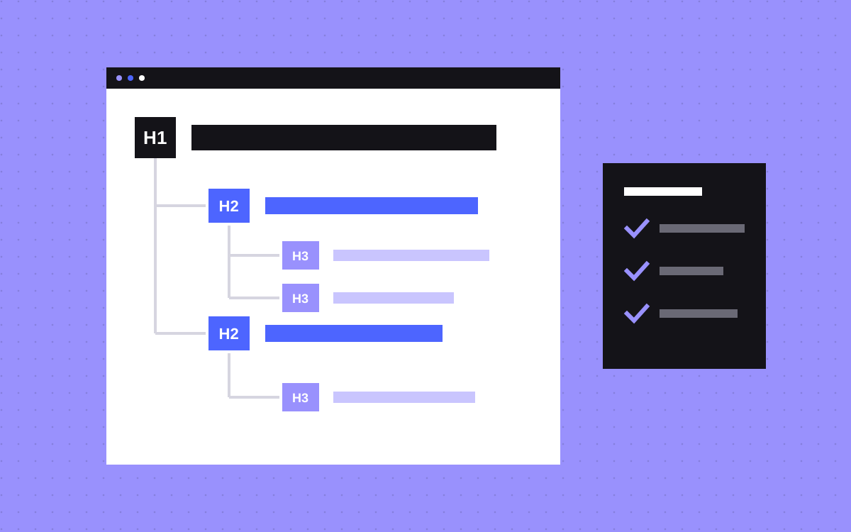
- Use one H1 that says what the page is about, H2s for the main sections and H3s inside them.
- Do not skip levels on the way down. The W3C says skipping heading ranks can be confusing and should be avoided where possible.
- Google's SEO starter guide says heading order does not matter to Google Search, and that it is fantastic for screen readers. Get it right for people.
- Choose the heading level for meaning and set the size with a class. In Webflow the tag and the style are separate settings.
- Check a page by listing its headings in order. The list should read like a table of contents.
The short answer
Give every page one H1 that says what the page is about. Put H2s under it for the main sections and H3s under each H2 for the points inside that section. Do not skip a level on the way down. Pick each heading level for what the text means in the outline, never for how big it looks, and set the size with a class instead.
That one habit serves three readers at once: people who scan, people who use a screen reader, and search engines that need to work out what the page covers.
What headings do
Headings are the outline of a page. The W3C's headings tutorial puts it simply: headings communicate the organization of the content on the page, and browsers and assistive technologies can use them to provide in-page navigation.
In practice that means three things:
- Readers scan. Most people read the headings first and then decide which section to read.
- Screen reader users jump. MDN notes that a common way to use a screen reader is to jump from heading to heading, and that most screen readers can build a list of all the headings on a page.
- Search engines read them too. Google lists heading elements, such as the H1, among the sources it can use for the title link it shows in search results.
One clear H1: what Google actually says
You will often read that more than one H1 hurts your rankings. The Google pages we read do not say that, so we will not say it either. Here is what they do say.
- Google's SEO starter guide says there is no magical, ideal amount of headings a page should have. It sets no rule on the number of H1s.
- Google's page on title links says it can be confusing if multiple headings carry the same visual weight and prominence. When it is not clear which text is the main title, Google may use the first heading as the title link.
- The same page suggests making the main title stand out as the most prominent text on the page.
On the HTML side, MDN says several H1s are allowed by the HTML standard but are not considered a best practice, and that a page should generally have a single H1 that describes its content.
So the honest advice is this: use one H1 because it makes the main title obvious to readers, to screen reader users and to Google when it picks a title. Do not expect a ranking jump from it, and do not panic if an old template has two.
No skipped levels
The W3C's rule is to nest headings by their rank. An H2 starts a section. An H3 inside it starts a subsection. It also says skipping heading ranks can be confusing and should be avoided where possible.
Two details from the same tutorial are worth knowing:
- Going back up is fine. After an H4 you can start a new H2. That closes the subsections, it does not skip anything.
- Fixed areas can stay fixed. In parts of the page that repeat, such as a sidebar, the W3C says consistency across pages matters more than matching the content area.
Does order matter for search? Google's starter guide is direct. It says having your headings in semantic order is fantastic for screen readers, but from the Google Search perspective it does not matter if you use them out of order. Keep the order right for people.
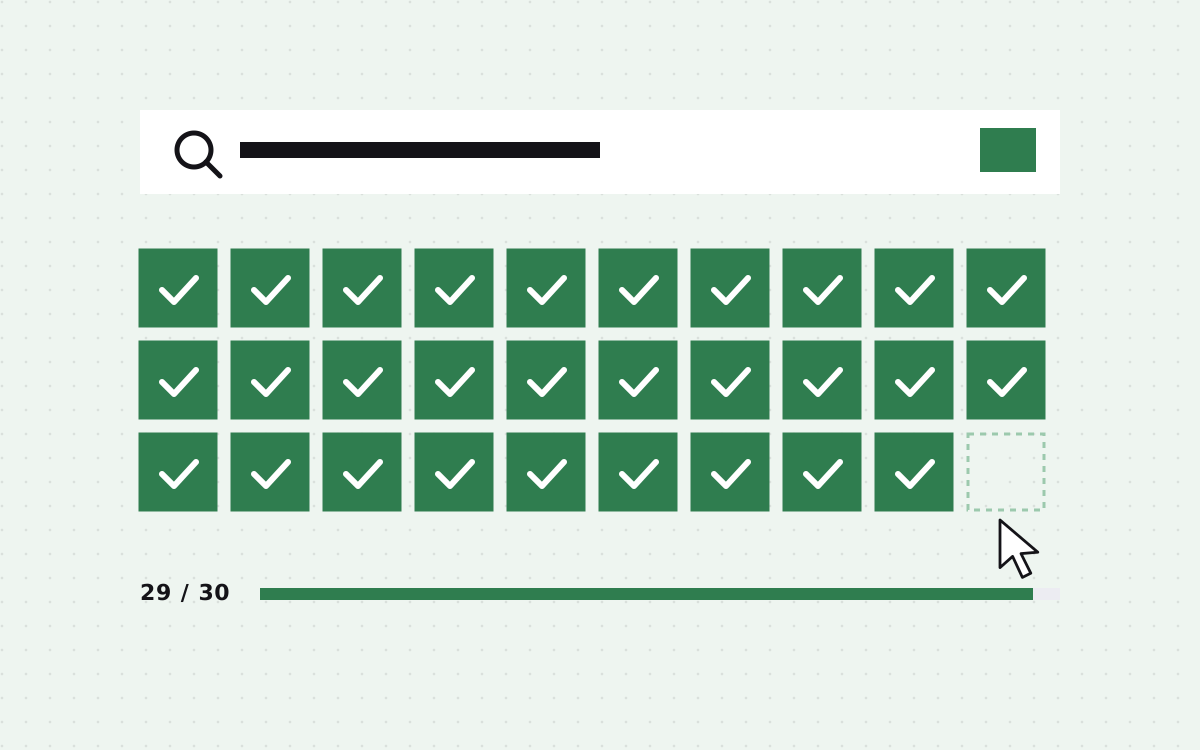
It is a common miss. In our own study of the accessibility of top cloud company home pages, 29% skip heading levels, on pages where the median home page scores 93 out of 100 on Lighthouse accessibility (Forbes Cloud 100, checked 16 November 2026). A high score does not mean the outline is right.
Choose headings for meaning, not size
Most broken outlines come from one habit: picking a heading level because of how it looks. Someone wants smaller text, so a section title becomes an H4. Someone wants a big number in a stats row, so it becomes an H2.
MDN's advice is plain: do not use heading elements to resize text, use CSS for that. The tag says where the text sits in the outline. The style says how it looks. Keep the two apart.
- Big text that is not a section title. Stats, pull quotes and taglines are paragraphs or plain text blocks with a large style.
- Small text that is a section title. It keeps its real level and gets a smaller style.
- Labels above headings. A short label such as "Pricing" above the real heading is usually plain text, not a heading of its own.
- Card titles. Cards inside an H2 section take H3s, even when the design makes them small.
Question-style H2s for answer-first pages
This part is our own practice, not a rule from Google or the W3C. On pages written to answer questions, such as guides, service pages and FAQs, we often write the H2 as the question a buyer would type, and put the answer in the first sentence under it.
Example for a bakery software company called Crumb:
- Weak H2: "Flexible plans"
- Clear H2: "How much does Crumb cost?" followed by one sentence with the answer, then the detail.
It helps a reader who scans, because each heading tells them what they will learn. It also makes each section stand on its own, which is useful when a search engine or an AI assistant quotes one part of the page. Do not turn every heading into a question, though. A heading such as "Pricing" is fine when that is what people look for. Our post on page templates for AI answers shows full page layouts built this way.
In Webflow: the tag and the class are separate
Webflow keeps meaning and looks apart, which makes this easy to get right.
- The tag. Webflow's Heading help page lists six options, H1 to H6. You pick the heading type in the element's Settings panel.
- The look. You style a heading in the Style panel and can give it a class name. So an H3 can carry a large style and an H2 a small one.
A simple setup that works: create size classes that are not tied to a tag, for example "heading-large", "heading-medium" and "heading-small". Pick the tag for the outline, then add the class for the size. Designers get the look they want and the outline stays correct.
Webflow also checks this for you. Its Audit panel flags skipped heading levels, for example an H2 followed by an H4. The fix on that help page is to select the heading, open the Settings panel and press the heading type that was skipped. One limit from the same page: the Audit panel does not check inside components, so check those by hand.
Watch rich text fields in the CMS as well. Whoever writes a blog post picks the heading levels there. If the template already has the post title as the H1, tell writers to start at H2.
How to check a page outline
- List the headings. Write down every heading on the page in order, with its level. A browser extension or an accessibility tool can list them for you.
- Read only the list. Does it make sense as a table of contents? If a heading says "Learn more" or "Why us" with no context, rewrite it.
- Count the H1s. There should be one, and it should say what the page is about.
- Look for jumps. An H2 followed by an H4 is a skipped level. An H4 followed by an H2 is fine.
- Look for fake headings. Bold paragraphs that act as section titles should be headings. Headings used only for big text should not be.
- Run a tool. Lighthouse in Chrome has an accessibility check for heading order, the same one our study used. Our free AEO checker looks at heading order too, and in Webflow the Audit panel does it before you publish.
- Check the templates. Fix a CMS template once and every page built from it is fixed.
An automated check will not tell you if a heading is clear. That part needs a person to read the list.
What to do next
Pick your five most visited pages and list their headings today. Fix the H1 first, then the skipped levels, then the headings that say nothing. After that, fix the templates so new pages start right.
Headings are one line on a longer list. Our Webflow SEO checklist and Webflow accessibility checklist cover the rest. If you would like us to check or rebuild the structure of your site, see Webflow SEO or send us your site.

Terms used: Webflow, Core Web Vitals