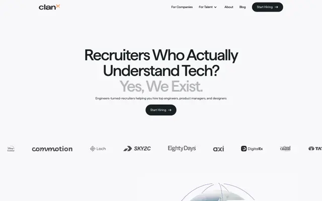

- A hero must answer three things fast: what is it, who is it for, and what do I do next.
- Test it on a stranger, then run the ten checks. Do not begin with the design.
- Fix the headline first. A better picture cannot rescue an unclear sentence.
- Check it on a real phone, because that is where most heroes break.
- Rolling words are fine if the first one is in the HTML and the sentence reads well without motion.
The short answer
To review a hero section, check whether a stranger can say what you sell, who it is for and what to do next, from the first screen alone. Show it to someone for a few seconds, hide it, and ask them. Then check the headline, the line under it, the button, the visual, the proof, the phone view and the loading. Fix the words before the design.
This post is for a page you already have. For writing a new one from nothing, see how we design landing pages.
Run the stranger test first
Find someone who has not seen the page. A person in another job is ideal, and anyone outside your company is better than a colleague.
- Open the page on their phone, or on your own.
- Let them look for about five seconds, then hide it.
- Ask: what does this company sell? Who is it for? What would you click?
- Write down their exact words, and do not explain anything.
Repeat with two or three people. If all of them miss the same thing, you have your first fix. Their words may also be better than yours, so steal them.
The ten checks
| Check | Pass | Fail |
|---|---|---|
| Headline says what you sell | Names the thing or the outcome | Could be any company |
| Audience is clear | Reader can rule themselves in | "For modern teams" |
| Subhead adds something | Says how, or for whom | Repeats the headline |
| One main button | One clear action | Three equal buttons |
| Button says what happens | "Book a 20 minute call" | "Submit" or "Learn more" |
| Visual shows the thing | Real product or real work | Abstract shapes, stock smiles |
| Proof is near | A real logo, review or name | Nothing, or invented praise |
| Fits on a phone | Headline and button on the first screen | Button below the fold |
| Reads with no motion | Sentence works when still | Blank until animation ends |
| Loads steady | Text stays in place | Heading jumps or flickers |
Score each pass or fail, and start with the top rows. We weigh the first three most.
Fix the headline with one pattern
If your headline fails, try this shape: what it is, for whom, with what result. You may not need all three, so drop what the rest of the page covers.
An invented example:
| Version | Headline | Problem |
|---|---|---|
| Vague | Work, reimagined | Could be anything |
| Feature led | AI powered shift scheduling platform | Clear, but not why it matters |
| Clear | Staff rotas for restaurants, done in ten minutes | Only if ten minutes is true |
That last note matters. A specific claim must be one you can defend, so use a number only when you have it. Clever lines can work too, as long as the line under them does the explaining.
Then the subhead and the button
Subhead. Give it one job. If the headline says what, the subhead says how or who for. Two lines is usually enough on a phone, and it should not repeat the headline in other words.
Button. Choose one main action and match it to the visitor's stage. Someone on an ad for a small offer may not want a sales call. Say what happens next, and put any reassurance beside it, such as how long a call takes. A second, quieter link is fine for people who are not ready. Three matching buttons usually means nobody decided.
Judge the visual by one question
Does the visual show what you sell, or only decorate the page? For a product, show the product doing the job. For a service, show real work. We use real captures of client sites on our own work pages for this reason, in place of drawn mock-ups.
Run this check as well: cover the visual with your hand. If the page makes no less sense, the visual is decoration, so either make it useful or make it lighter. Check that any text inside the picture is readable on a phone, and do not rely on a video to explain what the headline should have said.
Check it on a real phone
Desktop reviews miss most hero problems. Open the page on a real phone, not only a browser window made narrow.
- Are the headline and button both on the first screen? See above the fold.
- Does the headline break in an odd place, or leave one word alone on a line?
- Do a menu, a top bar and a cookie banner together cover the message?
- Is the button easy to reach with a thumb?
- Is the visual pushing the button down? On a phone, the words usually go first.
Rolling headlines: our rule
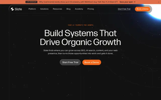
Our own home page has rolling words in the heading: "Your marketing site," and then a word that changes. So here is the rule we work to.
- The first word must be in the HTML, so the heading reads with JavaScript off. We had to fix this on our own site.
- The sentence must make sense with any single word. If one word is the real message, just use that.
- The space for the word must be reserved, so nothing around it moves.
- The motion must stop for people who ask for reduced motion.
- The stranger test must still pass with the first word alone.
If you cannot meet all five, use a plain sentence.
Check how it loads
The hero is usually the first thing to appear, and problems here are easy to see.
- Layout jumps. We once found our own home heading drew larger, then jumped, because a setting was applied only by a script at the end of a large page. Moving it into the HTML fixed the jump. Watch your hero on a slow connection for the same thing.
- Large image. A heavy hero image can slow the first view. Our site speed guide covers what we do on Webflow.
- Fade-ins. Text that waits for an animation is text people cannot read yet. A short slide is fine, but do not hide the heading behind a delay.
The order to fix things
- Headline, using the stranger's words if they are better.
- Subhead.
- Button label and number of buttons.
- Phone layout.
- Proof near the button.
- Visual.
- Loading and motion, unless something is visibly broken, in which case do it first.
Then run the stranger test again with new people. For the rest of the page, use our copy audit scorecard.
What to do next
Run the stranger test today with one person. It costs five minutes, and the answer tends to settle arguments about the headline.
If the page needs more than new words, we build landing pages from $500. Or send us your page, and we will tell you what we would change first.

Terms used: Hero section, Above the fold