- A B2B homepage should answer four questions fast: what is this, is it for me, can I trust it, and what do I do next?
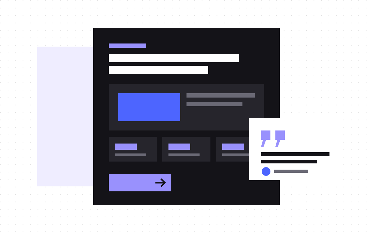
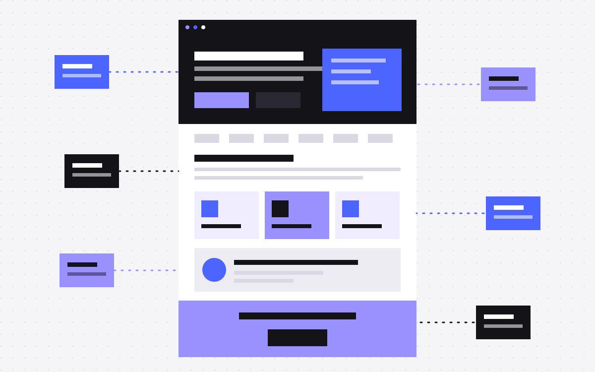
- A strong default order: hero, proof, problem, solution, how it works, use cases, results, objections, final call to action.
- Your homepage is a signpost for several types of buyer. Send each of them on to a deeper page.
- Cut any section that does not answer a real question from a real buyer.
- This is a starting point, not a law. Test it with your own buyers.
The short answer
A B2B homepage works best as a clear path: say what you do and who it is for, prove people trust you, name the problem, show how you solve it, handle doubts, and give one clear next step. Everything else is optional. In our experience, homepage problems come more often from unclear words than from a wrong layout.
Here is the order we start from, and why. Change it when you have a reason to.
Who your homepage is really for
B2B buyers rarely decide alone, and they rarely decide on the first visit. The same page may be read by:
- The person with the problem, who wants to know if you understand it.
- The budget holder, who wants a short case for the value and the risk.
- The technical or security reviewer, who wants to know if it fits their setup.
- Someone comparing vendors, who wants to place you quickly.
Do not try to convince all of them on one page. Give each one enough to trust you, and a clear link to the page they need. Read the pages every SaaS website needs for the wider site.
1. The hero
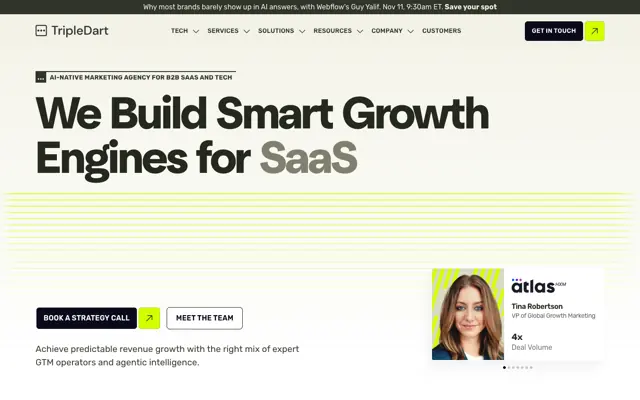
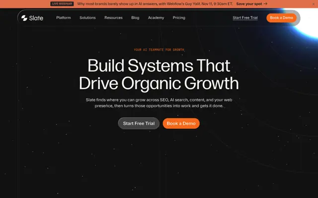
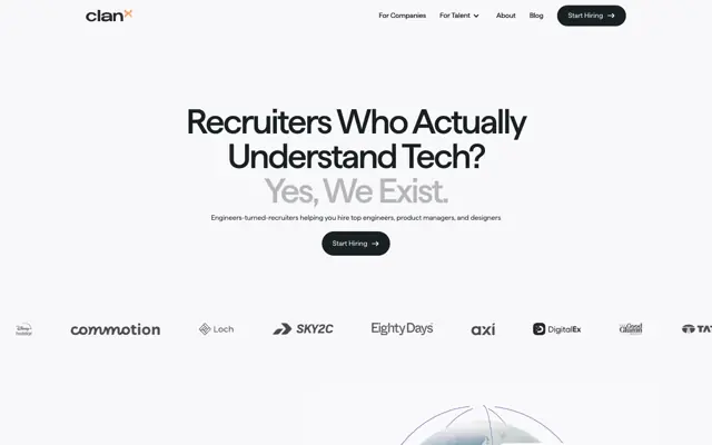
This is the part people see above the fold. It should answer what you do and who it is for, in plain words.
- Headline. The outcome or the category, not a slogan. Would a stranger understand it?
- Subhead. One or two lines on how it works and who it is for.
- Primary call to action. One main action, such as "Book a demo" or "Start free".
- Secondary action. A softer option for people who are not ready, such as "See how it works".
- A visual that shows the real thing. A clear product view often beats an abstract illustration.
A simple test: show the hero to someone outside your company for five seconds. Ask what you sell. If they can't say, rewrite it.
2. Proof, right away
Logos of real customers, a review rating or a short quote can sit directly under the hero. It tells a careful buyer that other companies have taken this risk. Use only what you have permission to show, and only what is true. A few recognisable names are better than a long wall that nobody reads.
3. The problem
Now show that you understand their world. Describe the problem in the words your buyers use, with a concrete situation they will recognise. Keep it short. Skip scare tactics. The goal is for the reader to think, "yes, that is us". If you do not know those words yet, read your sales call notes and support tickets. Our copywriting work usually starts there.
4. The solution, and how it works
Next, explain what you do about it. Pick three or so main capabilities, and describe each one by what it lets the customer do. Then show how it works, in a small number of steps. It lowers the fear that adopting you will be hard. Show the real product where you can, and be careful with mock-ups that promise more than you do.
5. Use cases or audiences
Help people find themselves. A short set of cards, by role, industry or use case, works well, and each one links to a deeper page. This is where the homepage acts as a signpost. It also gives you internal links to the pages you want to rank. Only list the groups you really serve.
6. Results and stories
Show what changed for a customer. A good story has the situation, what you did and what happened. Use real numbers only if you have them and can share them. Otherwise tell the story honestly without numbers. Put a name, a role and a company next to quotes. A vague quote from "a marketing manager" adds little.
7. Objections
Near the end, answer what stops people from taking the next step. This can include integrations, security, implementation effort, switching cost, contract terms and pricing. A short FAQ is often the simplest way. If you can show pricing or a starting price, consider doing so, or link clearly to a page that explains how it works. Clear answers here help readers, and they can also help search and AI tools find you. See What is AEO?
8. The final call to action
End with the same main action as the hero, and say what happens next, such as "A 20 minute call with no pitch deck". Reduce the fear of the next step. Keep the form short, since each extra field is a reason to leave. A long form may suit a high-value sale, but test that belief. See how we design landing pages that convert.
Sections you can usually cut
- "Why us" with generic claims. "Innovative", "trusted", "world class" say nothing that a reader can check.
- Company history. It belongs on the about page.
- Sliders in the hero. Later slides are easy to miss.
- Latest news. Keep it unless it really helps a buyer decide. Often it does not.
- Every feature. That is what the product page is for.
Common variations
- Self-serve product. Lead with the product and a free start. Show it working early, and add pricing higher up.
- Sales-led product. More focus on trust, security and outcomes, with a demo as the main action.
- Services firm. Replace product views with work samples, process and the people you will work with.
- Several products. The homepage explains the whole company, then routes people to each product page.
How to test your homepage
- Ask five people who match your buyer to read it, and to say what you do and who it is for.
- Watch recordings or heatmaps if you have consent to use them, to see where people stop.
- Check where people go next in analytics. That tells you what they came for.
- Run an A/B test if you have enough traffic. If you do not, talk to buyers instead.
- Check it on a phone. Long pages feel much longer there. See CRO.
What to do next
Take your current homepage, write the question each section answers next to it, and cut what has no answer. If you want help, see website design, strategy and copywriting or landing pages. Or send us your homepage and we will tell you what we would change first.

Terms used: Wireframe, Call to action (CTA)